
The Style Editor gives your certificates a branded, professional look. A design is a small pack that can hold a cover page, a matching end (back) page, header and footer bands that repeat on every page, and a set of report colours. Apply a design to the certificate types you choose, and every report of that type renders with it automatically — nothing to remember at print time.
To open it, go to the File menu in Shine Forms and choose Style Editor — it sits alongside the Schedule Manager.
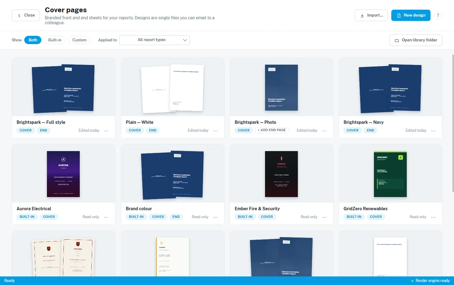
The library
The Style Editor opens on your design library. Each card shows a live thumbnail of the design — cover and end pages fan out as a pair — along with its name, what it contains (COVER, END), and when you last edited it.
A few things to notice:
- BUILT-IN marks the read-only designs that ship with the app. Your own designs show an “Edited” date instead of “Read-only”.
- Applies to N report types under a design’s name tells you it is in use on your reports.
- The Show filter narrows the gallery to built-in or custom designs, and the Applied to dropdown shows only the designs applied to a particular certificate type.
- Open library folder opens the folder holding your design files, in case you want to back them up.
Every card has a ⋯ menu with its actions: rename, apply to report types, preview a PDF, save the pack to a file, or delete. Deleted designs go to the recycle bin, so a mistake is recoverable.
Built-in designs
The app ships with a set of read-only starting points:
- Three starters — Brand colour, Photo cover and Plain & simple — clean, general-purpose designs that pick up your company details automatically.
- Six showcase designs — complete branded looks for fictional companies (Aurora Electrical, Ember Fire & Security, Voltware Electrical and friends) that show what the editor can do, from full-page photography to formal heritage styling.
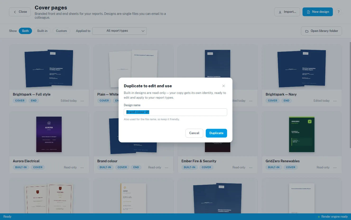
Built-in designs can’t be edited or applied directly — anything used on your reports lives in your own library. Instead, choose Duplicate to edit and use… (or just click the card): your copy gets its own name and identity, opens in the editor, and is yours to re-brand and apply.
Tip: not sure which one you like? ⋯ → Preview PDF… renders any design — built-in or your own — on a sample certificate before you commit to anything.
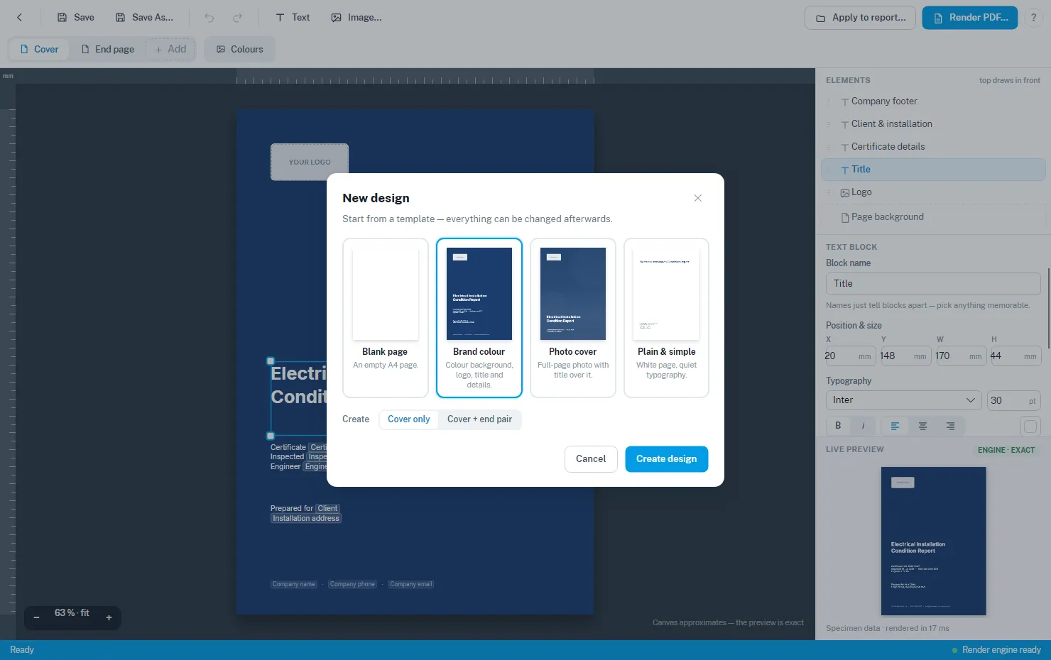
Creating a design from scratch
New design starts you from a template — a blank page, or one of the starter looks — as a cover only or a cover + end page pair. Everything can be changed afterwards.
The editor
Click one of your designs to open it in the editor.
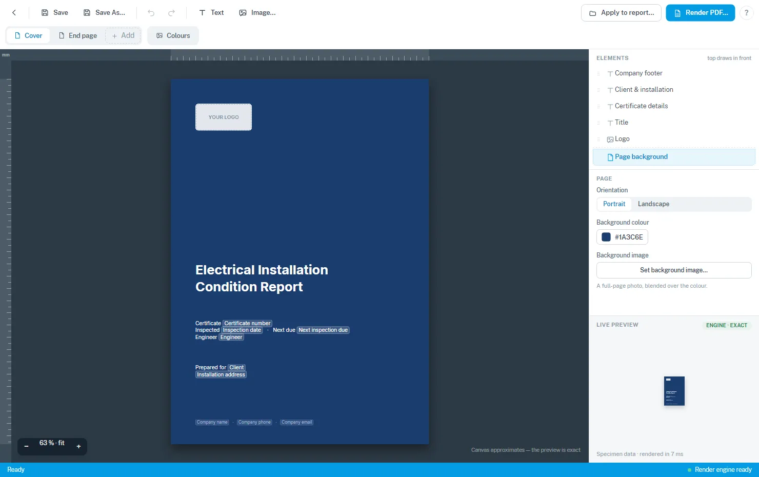
- The canvas is your page. Drag blocks to move them, drag the handles to resize, and use the arrow keys to nudge. Undo covers everything.
- Text blocks can include details that fill in from each certificate — the certificate number, inspection dates, client and installation address, your company name and contact details — so one design works for every job.
- Image blocks hold your logo or photography. A built-in photo editor lets you crop, rotate and annotate without leaving the app.
- The tabs along the top switch between the cover, the end page, and the repeating header, footer and edge bands — use + Add to give a design the parts it doesn’t have yet.
- The Colours tab sets the report’s section colours — headings and shading through the body of the certificate, matched to your brand.
- The live preview on the right shows exactly what the rendering engine will produce.
Save with Ctrl+S. The design’s name is also used for its file name, so keep it friendly.
Seeing it on a real report
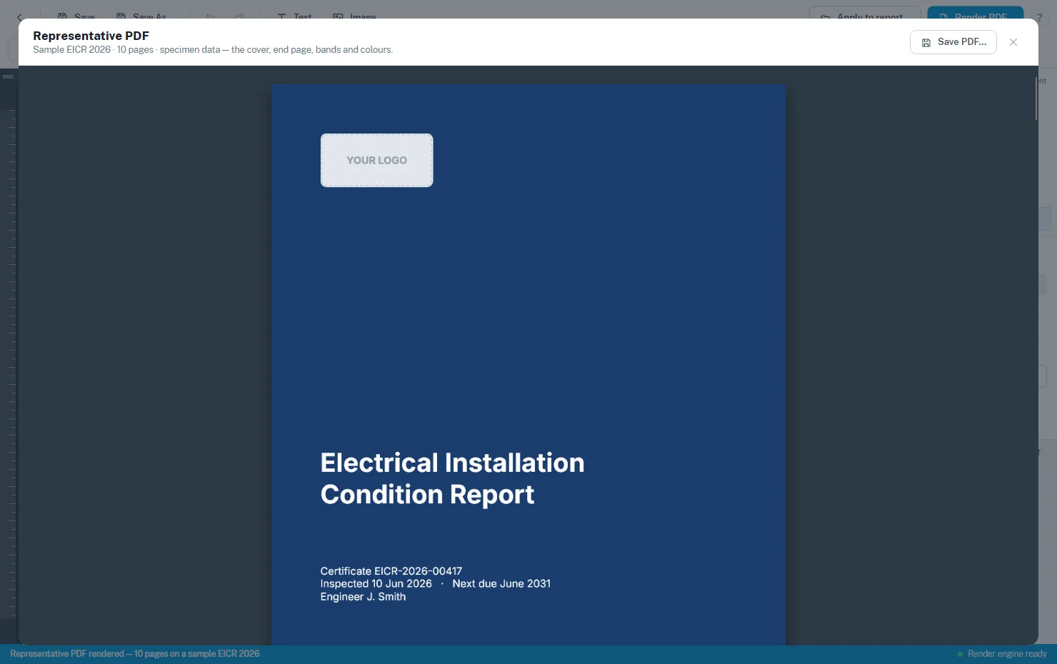
Render PDF… in the editor — or ⋯ → Preview PDF… on any library card — renders the whole design on a sample EICR with specimen data: cover in front, end page at the back, bands and colours throughout. Save PDF… in the viewer gives you a copy to share.
Applying a design to your certificates
When a design is ready, choose ⋯ → Apply to report type… on its card (or Apply to report… in the editor).
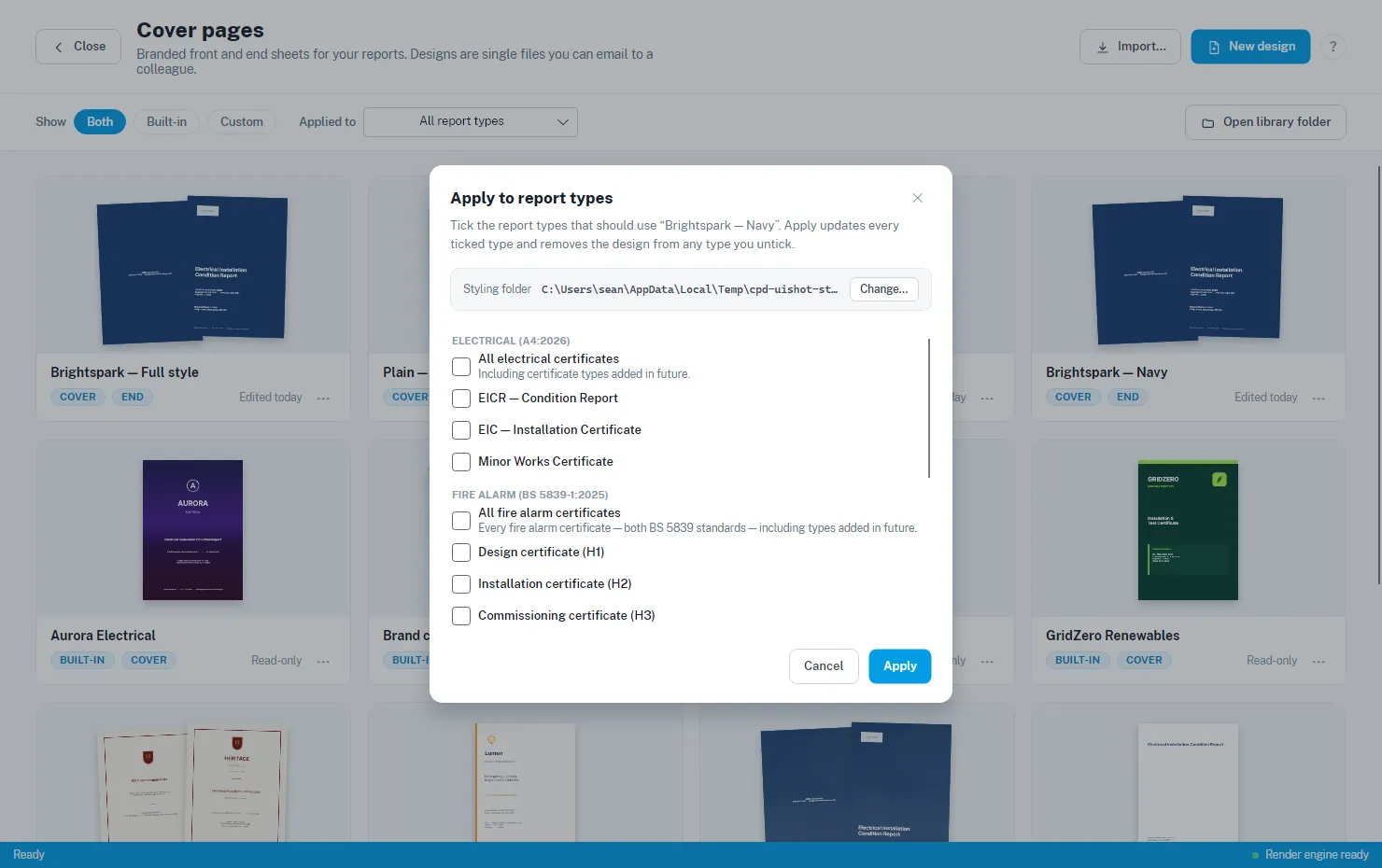
- Tick the certificate types that should use the design. Each report type carries one design, so applying replaces whatever was there before.
- The All … certificates rows cover a whole family in one tick — including certificate types added in future versions, so a family design never goes stale.
- Apply updates every ticked type and removes the design from any type you untick — the tick list is always the whole truth.
From then on, those certificates print with the design automatically. The card shows “Applies to N report types”, and the library’s Applied to filter finds the design in use for any given certificate type. Reports with no applied design simply print as they always have.
Sharing designs
A design is a single file you can email to a colleague:
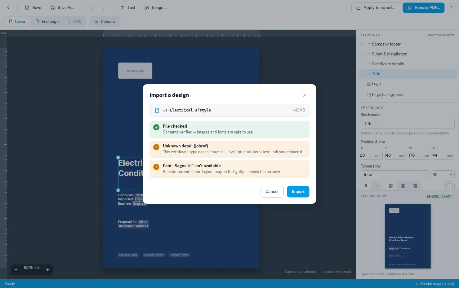
- ⋯ → Save pack to file… exports the design as one
.sfstylefile. - Import… (top right of the library) brings one in. The import is checked first — you’ll be warned if the design uses details or fonts this machine doesn’t have, and a damaged file is refused with an explanation.
Renaming and deleting
- ⋯ → Rename… renames the design and its file. Anywhere the design is already applied stays linked — your reports carry on rendering with it.
- ⋯ → Delete design… moves the design file to the recycle bin. Report types it was applied to keep their copy of the design, so those reports print unchanged until you apply a different design to them.